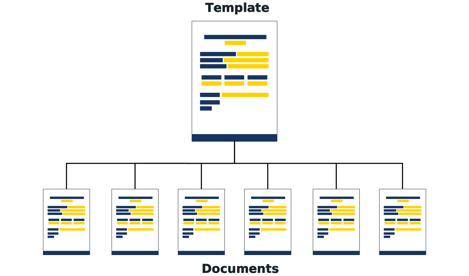
Templates are a cornerstone of the structured data model used in Pelicopy. All documents are created based on them and follow the pre-defined layout and style.
A template is where you decide what your document looks like — which sections appear, which static text is included, which fields the person filling in the document will need to complete, and how the final PDF will be typeset. Once a template is published, every document built from it inherits that layout automatically.
Templates Overview
The Templates page lists every template in your organization. Each row shows:
- Name — the human-readable name of the template.
- Revision — the latest revision number.
- Status — draft or published.
- Created by — the user who originally created the template.
- Last edited — when the template was last modified.
- Actions — edit, duplicate, or delete.
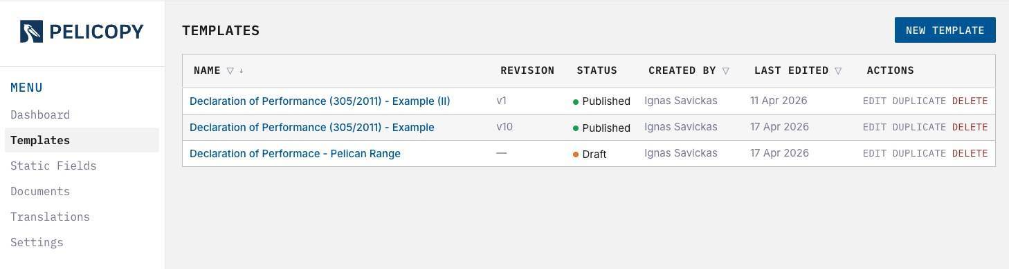
You can use the filters at the top of most columns to narrow the list by status, name, or other attributes.
The New Template button in the top right starts a new template from a blank canvas.
Template Editor
The template editor is where you design your layout. It opens as a full-screen workspace with the page rendered in the center, a toolbar above the canvas, and tabs at the top for switching between the Template body and the Cover Page.
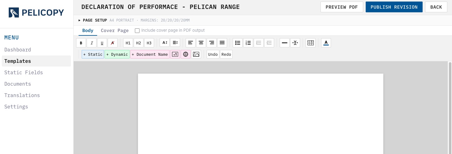
The editor auto-saves every 30 seconds, so your work is never lost even if you close the tab mid-edit.
Template Editor: Page Setup
Page Setup controls how the physical PDF page is laid out. You can configure:
- Page Size — A4, US Letter, and other standard sizes.
- Orientation — portrait or landscape.
- Margins — top, bottom, left, and right, in millimeters.
- Page Numbers — tick the “Show page numbers” option to enable numbering. When enabled, you can choose:
- Alignment — left, center, or right.
- Offset — distance in millimeters from the bottom margin.
- Color — the color of the page number.
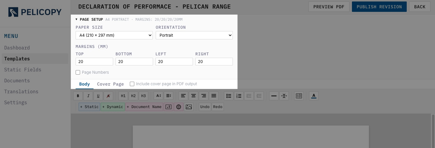
Page Setup should be configured before you start designing, so your layout matches the final paper size.
Template Editor: Body and Cover Page
The editor has two tabs: Template and Cover Page.
- The Template body carries the main content of your document and its translations. It repeats once per language in the final PDF — so if your document is produced in four languages, the body appears four times.
- The Cover Page is optional and appears only once at the start of the PDF. It’s designed in its own tab. To include it in output, tick the “Include cover page in PDF output” checkbox next to the tab.
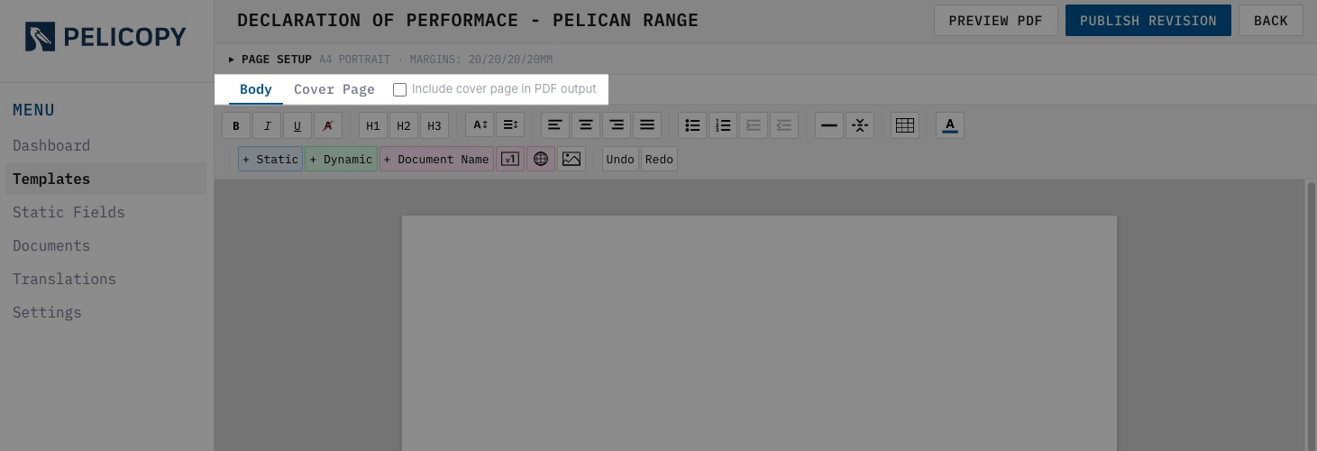
The toolbar is identical in both tabs. Switch freely between them — your edits are preserved on both sides.
Template Editor: Toolbar
The toolbar sits above the canvas and offers every formatting and insertion tool you’ll need.

- Bold / Italic / Underline — toggle character styles on selected text. Also applies to selected static and dynamic field nodes.
- Clear Formatting — strips all formatting from the current selection, returning it to the template’s default style.
- H1 / H2 / H3 — apply heading levels to the current block.
- Font Size — set the size of selected text in points.
- Line Spacing — adjust the spacing between lines in the selected paragraph.
- Left / Center / Right / Justify — align the current block.
- Bullet List — turn the current block into a bulleted list.
- Numbered List — turn the current block into an ordered (numbered) list.
- Increase / Decrease Indent — indent or outdent list items. This tool works only on list items, and indentation is capped at three levels. A level 3 item can only exist underneath a level 2 item — you cannot jump directly from level 1 to level 3.
- Horizontal Spacer — insert an empty horizontal space to create vertical breathing room between blocks.
- Page Break — force the following content to start on a new page.
- Add Table — insert a table. A secondary menu appears whenever your cursor is inside a table, with extra controls for adding and removing rows and columns, toggling a header row, setting cell background color and vertical alignment, adjusting borders, and resizing columns.
- Text Color — change the color of selected text.
- + Static Field — insert a static field from the library. Opens the static-field picker modal.
- + Dynamic Field — create and insert a new dynamic (green) placeholder. Opens the dynamic-field modal.
- + Document Name — insert the pink Document Name field. It resolves to the document’s name at PDF generation time.
- + Version Number — insert the pink Revision field, which resolves to the current revision number.
- + Language Index — insert a clickable list of languages included in the PDF. After clicking the button, choose between Column list or Inline format from the dropdown.
- Insert Image — upload an image into the layout. Images are capped at 100 KB each. The limit is intentional: it keeps generated PDFs small and fast to download, which matters because a document produced in many languages can otherwise grow to tens of megabytes. After inserting an image, clicking on it brings up an image-specific menu for adjusting its size, alignment, and a delete button.
- Undo / Redo — step back and forward through your recent edits.
Template Editor: Table Toolbar
When your cursor is inside a table, a second row of buttons appears on the toolbar with controls specific to tables.

- Insert Column — add a new column next to the current cell.
- Delete Column — remove the column containing the current cell.
- Insert Row — add a new row next to the current cell.
- Delete Row — remove the row containing the current cell.
- Delete Table — remove the entire table from the layout.
- Merge Cells — combine the currently selected cells into a single cell.
- Split Merged Cells — split a previously merged cell back into its original cells.
- Toggle Header Row — mark (or unmark) the top row as a header. Header rows are styled distinctly and automatically repeat at the top of each page when a table spans a page break, so column headings stay visible throughout the table in the PDF.
- Cell Fill Color — apply a background color to the selected cell or cells.
- No Fill — remove any background color from the selected cells.
- Align Top / Middle / Bottom — set the vertical alignment of the cell contents.
- Hide Table Borders — toggle off the cell borders for a cleaner look (useful for layout tables where the grid isn’t meant to be visible).
- Row Spacing — dropdown that sets the row height density. Choose between Compact (tighter rows, for data-dense tables) and Standard (roomier rows, for readability).
Template Editor: Preview PDF
The Preview PDF button renders the template as a PDF so you can inspect the final output before publishing.
Dynamic fields and pink placeholders are replaced with placeholder text (e.g. [Product Name], [Revision]) so you can see exactly where each value will land once a real document is created. This is the fastest way to catch layout issues before you commit to a new revision.
Template Editor: Publish Revision
The Publish Revision button commits your draft as a new published revision. Once published:
- The revision is locked and becomes read-only.
- Documents that reference this template can be moved onto the new revision.
- A new revision number is assigned.
The button is visible only when you’re editing a draft. On a published template with no open draft, the button is hidden.
Template Editor: Back
The Back button returns you to the Templates overview. Any changes you’ve made to the draft are saved automatically when you navigate away — there is no separate “save” step to remember.
Template Editor: Edit
The Edit button lets you modify a published template by creating a new draft revision on top of it. It appears only on published templates and is hidden on drafts.
Clicking Edit creates a working copy of the current published revision. You can then change anything — layout, fields, formatting — and publish the result as a new revision. Importantly, the draft only becomes persistent if you actually publish it: if you make edits and leave without publishing, no draft is kept, and the template stays on its original published revision.
Template Editor: Interacting with Data Fields
Each field type behaves differently in the editor.
- Static fields (blue) — their content cannot be interacted with directly in the template. Clicking a static field shows its text, but the text itself is managed from the Static Field Library. To change what a static field says, open the library and edit it there.
- Dynamic fields (green) — double-click a dynamic field to open the edit modal, where you can adjust the label, change the data type (single-line or multi-row text), and toggle the “required” checkbox.
- Pink fields (Document Name, Version Number, Language Index) — cannot be interacted with. They resolve automatically at PDF generation time. You can delete them, but there are no properties to configure.
Template Editor: Inserting Data Fields
Inserting a Static Field
Clicking + Static Field opens the static-field picker modal. Inside you’ll find:
- A search bar at the top to filter the library by name or content.
- A list of available static fields, each with its name and a preview of its text.
- Selecting a field inserts it at the current cursor position.
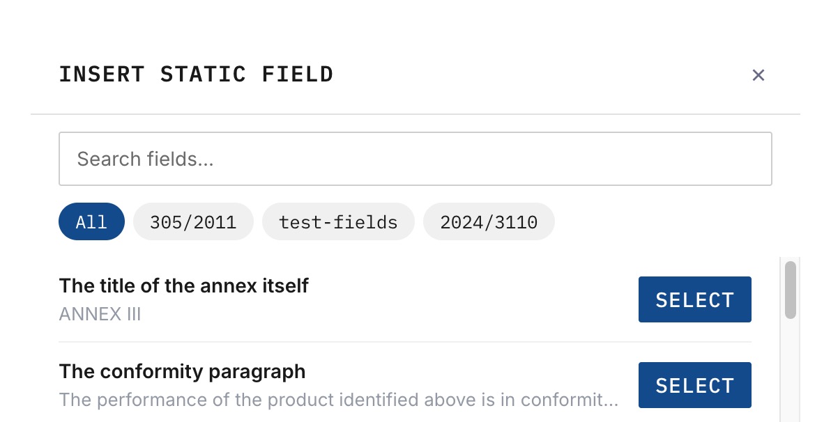
A static field brings all of its existing translations with it — the moment it’s inserted, every language already translated on that field is available at PDF time.
Inserting a Dynamic Field
Clicking + Dynamic Field opens the dynamic-field modal, where you define the placeholder:
- Label — the name that appears in the document editor when someone fills in the document (e.g. “Product Name”, “Batch Number”).
- Data Type — either Single-line text for short values or Multi-row text for longer content that needs paragraph breaks.
- Required — checkbox that marks the field as mandatory. Documents cannot be published until their required fields are filled in.
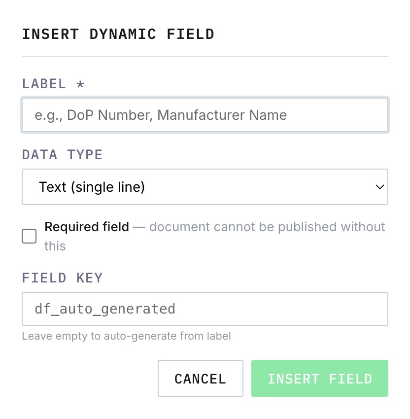
Clicking Insert adds the new placeholder at the cursor position.
Inserting a Pink Field
- + Document Name and + Version Number insert immediately at the cursor position — there are no options to configure.
- + Language Index opens a small dropdown first, letting you choose between:
- Column list — a vertical list of languages, typically placed on the cover page.
- Inline — a comma-separated row, suitable for placement inside a paragraph.