The Dashboard is the landing page of Pelicopy — the first thing you see after signing in. Its content adapts to your role, so everyone lands on the view that’s most useful for the work they’re about to do.
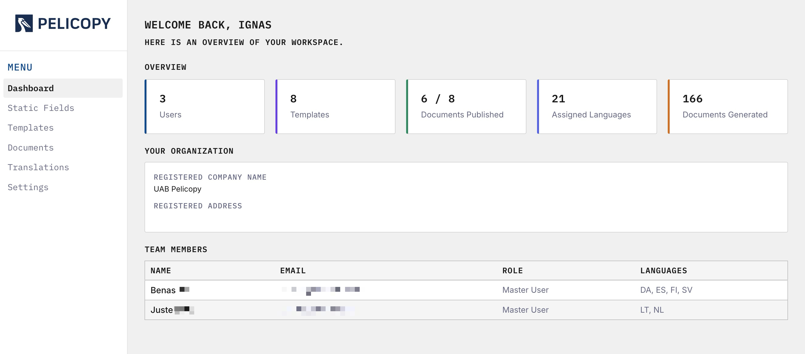
A Role-Adaptive Home
The Dashboard renders differently depending on who you are.
Admin
As an admin, the Dashboard gives you a full operational overview of the workspace:
- Users — how many users are in your organization.
- Templates — how many templates are defined.
- Documents Published — a live counter, shown against your organization’s published-document limit if one is set (e.g.
14 / 50). - Assigned Languages — how many languages you personally are allowed to translate.
- Documents Generated — the total number of PDFs your organization has produced.
Each stat card is clickable and jumps to the relevant section of the app — Templates to the templates list, Documents Published to the documents list, and so on.
Below the stat cards you’ll find:
- Your Organization — a read-only card with your registered company name and address, so it’s always visible at a glance.
- Team Members — a table listing everyone on your team, their email, role, and assigned languages. A quick directory for admins managing a growing organization.
Master User
Master Users see the same layout, scoped to the things they can act on: Templates, Documents Published (against the org limit), Assigned Languages, and Documents Generated. The Assigned Languages, Your Organization, and Team Members sections are also present.
Translator
Translators get a focused, task-oriented Dashboard. Instead of stat cards, the landing page leads with a single large call-to-action button — Open Translation Queue — that takes them directly to their work. Below it, the Dashboard still shows their Assigned Languages, organization info, and team members for context.
What the Dashboard Is For
The Dashboard isn’t the place you do work — it’s the place you orient yourself before starting. A quick read of the stat cards tells you where your organization stands on usage limits, how many published documents are live, and who you’re sharing the workspace with. From there, you click through to the section you actually need, or (as a translator) dive straight into the queue.
The functionality of the dashboard will be broadened in the future.